Blue has a rich history in art, culture, music and language. It’s a prominent colour in my latest paintings too. Something which started way before the lockdown but has become important during the adaptations and restrictions caused by Covid-19. The process is a response to a specific location, time of day, and of nurturing well being.
It’s been a while since my last blog but I’ve continued to make images. My ways of working have had to adapt a little since the coronavirus pandemic. Life for everyone has changed and with it comes the anxieties and lows which stem from the situation. Everyone can be forgiven for feeling a bit blue, especially now.
Being unable to travel extensively, some projects are on hold. Reflecting upon what influences me closer to home, I’ve been drawn to the colour blue for some time now. With an accumulation of photographs, sketches and observations, this colour has been a source of curiosity and inspiration.
Blue is packed with symbolism in art, culture, music and language.
From ancient Egyptian decoration to the paintings of the great masters. The pigment was originally made from semi precious “lapis lazuli” stones only found in remote mountain ranges in what we now know as Afghanistan. Its value many times that of gold, only those subjects deemed most worthy would be painted with it. Hence the Virgin Mary wearing blue in Renaissance painting.
Blue clothing was once only worn by royalty and the powerful as a sign of opulence and status. Then came the creation of indigo dye, followed by the invention of denim to democratise clothing; from practical workwear for the “blue collar” worker to everyday fashion.
Chinese porcelain is famous for its distinctive blue and white designs and being from Stoke-on-Trent I shouldn’t forget to give Josiah Wedgewood and his blue Jasperware a mention either!
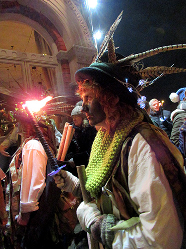
In language and music the phrases using blue and the songs with it in the title are numerous. Think of the saying “once in a blue moon” or “Blue Moon” by Elvis Presley, “Blue Suede Shoes”, to New Order’s “Blue Monday” and the classic jazz album “Kind of Blue” by Miles Davis to name a few. It even sums up a whole genre of powerful, soulful and emotional music, “The Blues”.
Back in December 2019, Pantone revealed its Classic Blue as their colour of the year for 2020. Described as “Instilling calm, confidence, and connection, this enduring blue hue highlights our desire for a dependable and stable foundation on which to build as we cross the threshold into a new era.” They could not have predicted what was to come next…
Once you start digging and looking into this colour in all its symbolism and ambiguity, you start to realise how culturally embedded and significant it is around the world. Which leads me to my little creative corner of it.
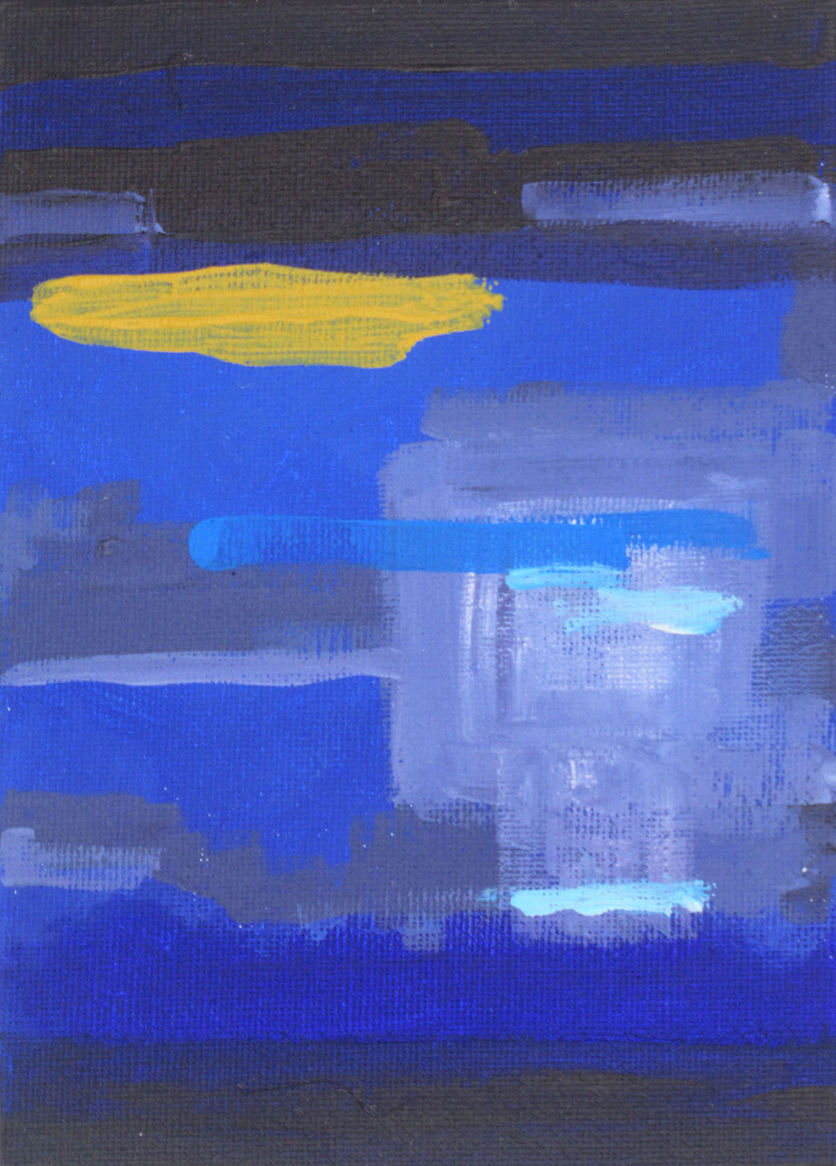
Untitled Works in Blue
The weather here in the UK has mostly been good with dry, bright sunny skies throughout April and into May. Meteorologists will point to the area of high pressure which has sat over the country. I wonder whether the lack of pollution from road traffic and fleets of planes being grounded has also contributed to this clarity? There is something wonderfully uplifting about an early morning blue sky. Equally, as the light fades on a sunny day, dusk has a calming effect.
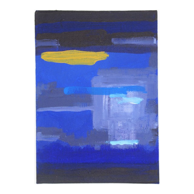
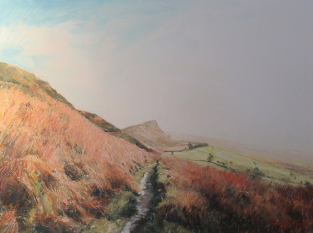
My latest work in progress is a series of paintings, or small studies in blue to be exact. Based around the Trent and Mersey and Caldon canals in Stoke on Trent. This is an area I have walked extensively with my dog, at all times of day, through all seasons and in all weathers. It is a special place to me because once you step onto the canal tow path you escape the busy main roads. The pace of life slows to a pedestrian speed. Mind and body start to relax and I start to feel present.
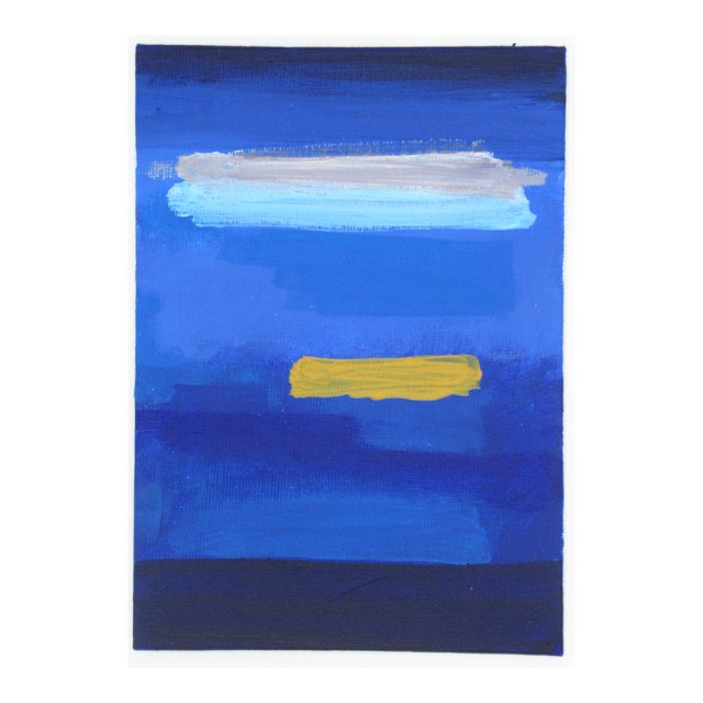
The moment in these works is when a sunny day is drawing to a close, or just beginning. A space on the cusp of day and night, yet not quite either. The reflections in the water and the transience of the place. A window which can last no more than half an hour. I have observed and absorbed this environment; smelled the cool air, listened to birdsong and geese honking. Becoming immersed in the sky and its distorted mirror image on the canal surface. It is a curious time where the creatures of the day are roosting and bedding down. While animals of the night are waking and emerging. Both world’s perfectly balanced for a brief period of time.
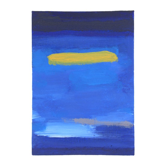
In taking all of this away, applying the paint is a reaction to the anxieties of a crisis, the news and a digital world. It is also about the fun and energising nature of creating something which is physically in front of you. Exploring its possibilities and imperfections. There is space for development; maybe the pieces will become bigger, more abstract, or perhaps they’ll tighten up. For now though, I am enjoying the intimacy of working at postcard size and in rediscovering materials which I haven’t used for far too long.
Whether anyone thinks it is good (or not) is not the point. More importantly, it is the product of pressing the pause button and feeling blue. Which for me is a mindful, calming and refreshing state.